
Resource Center / Playbooks / The Ultimate Website Launch Checklist (Pre- & Post-Launch Guide)
The Ultimate Website Launch Checklist (Pre- & Post-Launch Guide)
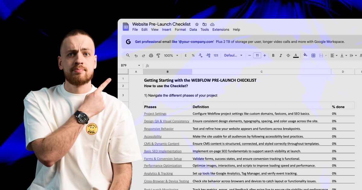
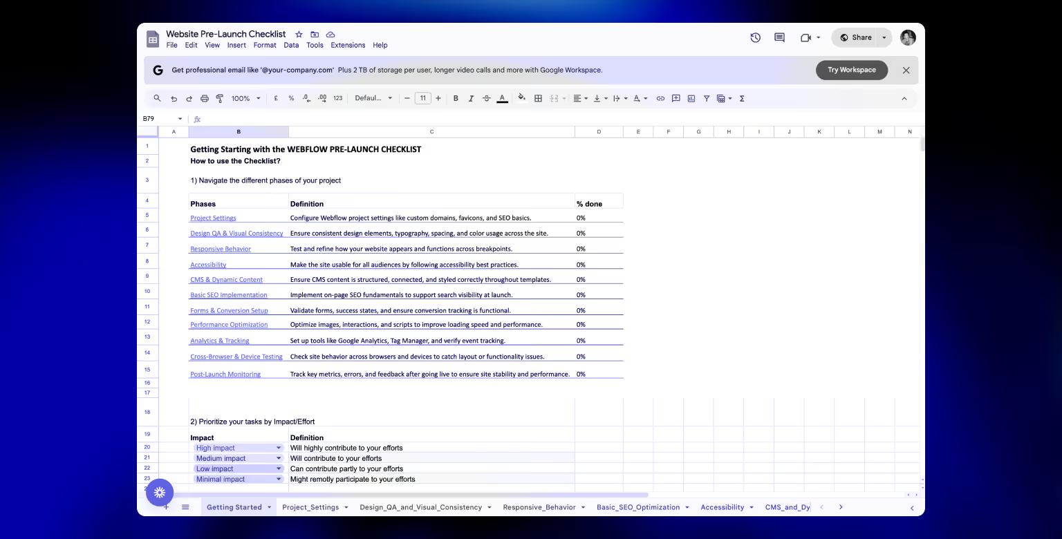
This checklist covers everything you need to review before hitting publish, from settings and SEO to performance and accessibility. Work through it below, or get the spreadsheet version sent to your inbox to share with your team.
Published Jul 31, 2025 • Last updated Sep 10, 2026 • Reviewed and updated quarterly by Khod's development and SEO team.

TL;DR
A website launch checklist is the difference between a clean launch and a fortnight of cleanup. Broken links, tracking that never fired, pages Google cannot see: every one of them is cheaper to catch before you publish than after.
This one runs to 61 checks across 16 categories, covering what to finish before go-live and what to watch afterwards:
- Settings: domain, SSL, redirect chains, favicons
- CMS: slugs, field bindings, metadata
- Analytics: GA4 events, session recording, conversion tracking
- QA: performance, accessibility, responsive and cross-device
- SEO: sitemap, robots.txt, indexability
- Post-launch: uptime, crawl errors, content and promotion
Tick each one as you go. Every task opens to say why it matters and which practitioner it came from.
This is the checklist we run on our own launches. The first version came out of our rebrand, when Tilipman Digital became Khod and the site was rebuilt in Webflow. It got sharper a while later, when we moved that same site off Webflow onto Next.js, because a replatform breaks a different set of things than a redesign does.
Whether you are a founder building a business website for the first time or a marketing lead running a broader B2B website strategy, the sequence is the same. It splits into two parts:
- Pre-launch: what to finish before hitting publish
- Post-launch: what to watch once visitors are on it
Tick each task as you go. Your progress is saved in this browser, so you can close the tab and come back to it. Each task opens to show why it matters, and which practitioner it comes from.
Your progress is saved in this browser. Nothing is sent anywhere.
Pre-Launch
42 of 61 checks · 10 categories
Project Settings
Domain, SSL and hosting basics that have to be right before anything else matters.
Connect and verify domain
Ensure DNS is set up and resolving correctly.
The domain is the one thing you cannot fix quickly after launch, because DNS answers are cached by resolvers you do not control.
Do this 24 to 48 hours before
- Drop the TTL on the A and CNAME records to 300 seconds. A 24-hour TTL means some visitors keep hitting the old host a full day after you switch.
- Lower it early, not at cutover. Resolvers hold the old record for the old TTL, so a last-minute change does nothing.
- Prepare every record you need in advance: A, CNAME for subdomains, MX for email, TXT for verification.
- Confirm you have registrar access yourself. Locked-out logins are the most common reason a cutover slips.
After it is stable
Put the TTL back up to a few hours once traffic looks normal. Leaving it at 300 seconds forever adds a lookup cost to every visit for no benefit.
Based on guidance from

Enable SSL and force HTTPS
Force every version of the URL to the secure one, in a single redirect hop.
You want exactly one hop. Both http://example.com and http://www.example.com should land on the final HTTPS URL directly, never via an intermediate.
What to test
curl -sILyour domain in all four combinations and read the Location headers- Every hop after the first is wasted latency in front of your Largest Contentful Paint
- Use 301 for a permanent move. Google does come to treat a long-lived 302 as permanent, but a 301 says so immediately and leaves nothing to infer
- Check that canonical tags point at the final URL, not at a URL that then redirects
The one that hides
Mixed content. The page loads over HTTPS while an image or script is hardcoded to http://, and the browser blocks or warns. Search the build for "http://" before launch rather than waiting for the padlock to go missing.
Based on guidance from

Set default domain
Choose between www and non-www and enforce it.
Search engines treat www and non-www as separate URLs. Google usually works out which one you meant and folds them together, but until it does you are relying on its guess, and any page it reads the other way is a page whose signals sit on the copy you did not choose.
How to settle it
- Pick the version that already has the most traffic and links, then 301 everything else to it
- Make the canonical tag point at the same version you redirect to, or the two instructions contradict each other
- Verify the domain property in Search Console, not just a URL prefix, so all four variants report in one place
- Update hardcoded absolute URLs in the build, which are the ones that keep pointing at the wrong variant
Why the canonical alone is not enough
Google treats canonical tags as a recommendation rather than an instruction, so both versions can still get indexed. The redirect is what settles it.
Based on guidance from

Content and Design Review
The last read of every page before it stops being editable in private.
Finalize all copy
Three passes: typos, read aloud, then inside the live template where the line breaks show.
Three passes, each looking for something the others miss. Doing them as one pass is how typos ship.
Run them in this order
- Once for typos and grammar, on the raw text, away from the design
- Once out loud, which is the only reliable way to catch rhythm and a sentence nobody can say
- Once inside the live template, where you see orphans, widows and headlines that break in the wrong place
Search the build before you sign it off
Look for Lorem, TODO, TBC, and your placeholder client name. They survive far more often than anyone expects, and they surface on the one page nobody reviewed.
Further reading

Ensure brand consistency
Align typography, colors, and UI elements with your style guide.
Drift never appears in the hero. It collects in the parts nobody designed, because those got built under time pressure by whoever was free.
Check these, not the homepage
- Form fields, and what focus and error states look like
- Empty states, which are usually the last thing anyone styles
- The footer, where old link styles and old logos survive longest
- Buttons: count how many variants exist against how many the guide defines
A quick numeric test
Count your font weights and your greys. If either number is higher than the style guide allows, something was added ad hoc and nobody wrote it down.
Based on guidance from

Review layouts
Zoom out to 50% and judge the shape of the page rather than the words.
Zoom the browser to 50% and look at the shape of the page rather than the words. Spacing problems and broken rhythm are obvious at that size and invisible at 100%.
What the zoomed-out view exposes
- Sections that all have identical weight, so nothing leads
- Inconsistent vertical spacing between blocks that should match
- Two sections of the same colour touching with no divider, the most common seam problem
- A page whose visual centre of gravity is not the thing you want read first
Then check the order
Squint at it. Whatever you can still make out is what the page is actually saying, and it should be the same thing you would say if you had one sentence.
Based on guidance from

Optimize images
Compress assets and add alt text to all visuals.
Images are almost always the heaviest thing on the page, and the fix is usually size rather than format.
The order to work in
- Size the file to the largest box it renders in. A 3000px image in a 600px slot costs the full download for no visible gain.
- Serve AVIF or WebP with a fallback. The saving over JPEG is large and the support is now broad.
- Set explicit width and height, or an aspect-ratio, on every image, or the page reflows as they arrive
- That reflow is most of a bad CLS score, and CLS is one of the three Core Web Vitals
Measure before you optimise
Run the page through a field-data tool and sort by transfer size before touching anything. It is common to find one forgotten hero image outweighing every other asset combined.
Further reading

Favicon and meta image
Set the favicon and share image, then check how the link actually previews.
The share preview is the first thing most people see of a new site, and it is generated from tags nobody looks at.
What to set and test
og:title,og:descriptionandog:imageon every template, not just the homepage- 1200x630 for the image, with important content away from the edges, because platforms crop differently
- Paste the live URL into Slack and LinkedIn's Post Inspector and look at what actually renders
- Force a re-scrape after changes, since platforms cache previews aggressively
The favicon trap
Favicons cache harder than anything else, so check in an incognito window. On Next.js a multi-size .ico will break the build outright; use a single size plus PNGs declared in metadata.
Further reading

Responsive & Cross-Device Testing
How the build holds up across widths, browsers and real devices, which is where a finished-looking site stops working.
Test all breakpoints
Check the layout at the five widths that cover real devices: 375, 768, 1280, 1440 and 1920.
There are phones, tablets, laptops and desktops. Take one width from each category and you have covered where almost everyone actually arrives.
The five widths
- 375px — phones.
- 768px — tablets.
- 1280px — laptops, where content starts getting cramped and two-column layouts give up.
- 1440px — the common desktop, and the width most designs get drawn at.
- 1920px — large monitors, where a missing max-width lets a line run to 150 characters.
Resize slowly, once
Drag the window from wide to narrow in one continuous motion and watch. Every jump, overlap and orphaned word shows itself in that single pass.
Two more worth doing
- A phone in landscape, where a sticky header eats most of the viewport.
- A page carrying its real content. Long headlines wrap differently from placeholder text, so a template full of filler will look fine and ship broken.
Based on guidance from

No horizontal scroll
Find the one element wider than its container before a visitor finds it on a phone.
Horizontal scroll is always one element wider than its container. The trick is finding which, and the browser will tell you.
Paste this in the console
- [...document.querySelectorAll("*")].filter(e => e.getBoundingClientRect().right > innerWidth)
- It returns the offending elements by name in about a second
The usual culprits
A fixed-width image, a negative margin on a full-bleed section, or a long unbroken string like a URL in body copy. Two more catch people out: 100vw counts the scrollbar, so a 100vw element is wider than the space you can actually see, and width: 100% inside a parent that scrolls comes out too wide where width: stretch does not.
Based on guidance from
Typography scaling
Validate font sizes and line heights across devices.
Type that scales by jumping at breakpoints reads as broken at every width in between. Fluid type solves it in one line.
The rules worth holding
- Never below 16px for body copy on mobile. Below that, iOS zooms the page when an input takes focus.
- Use clamp() so size scales with the viewport instead of stepping at each breakpoint
- Cap line length around 75 characters, past which reading speed drops noticeably
- Check line-height on headlines at the narrowest width, where two-line headings become four
Based on guidance from

Browser coverage
Chrome and Firefox rarely surprise you. Safari does, and it is a third of your visitors.
Chrome and Firefox rarely surprise you. Safari does, and it is a third of your visitors.
Where Safari diverges
- Date and time inputs, which render completely differently
- Flexbox gap on older versions
- backdrop-filter, and how it interacts with transforms
- Scroll behaviour and momentum, especially with a fixed header
Test states, not pages
Form validation, sticky headers, modals and focus behaviour are where engines disagree. A page can look identical in all four browsers and still be unusable in one.
Device variety
One iPhone and one mid-range Android, both physical, catch what emulators cannot.
An emulator gets the viewport right and everything else wrong.
What only a real device shows
- Touch target size, and whether your buttons are reachable with a thumb
- Scroll momentum and rubber-banding
- Font rendering, which differs enough to change line wrapping
- How a fixed header behaves when the browser chrome collapses on scroll
Two devices is enough
One iPhone and one mid-range Android, both physical. Test the Android someone would actually buy rather than a flagship, because the flagship hides performance problems.
Based on guidance from
Screen resolutions
Check a 1280px laptop, a 2560px monitor, and the page at 150% browser zoom.
Everyone tests at their own screen size. The problems live at the extremes.
Check both ends
- A 1280px laptop, where content gets cramped and two-column layouts stop working
- A 2560px monitor, where a missing max-width lets lines run to 150 characters
- 125% and 150% browser zoom, which behaves like a narrower viewport and is more common than most teams assume
Why zoom matters more than you think
A large share of people browse zoomed permanently, and it is the accessibility case most teams never test. If your layout survives 150% zoom it will survive most things.
Based on guidance from
Adrian Roselli
Accessibility Consultant
Accessibility
The checks that decide whether everyone can actually use the site.
Check contrast ratios
Meet WCAG standards for text and UI elements.
Contrast is the one accessibility rule that is fully measurable, which means there is no excuse for failing it.
The thresholds
- 4.5:1 for body text against its background
- 3:1 for large text, and for UI components and their states
- Brand colours that pass on white routinely fail on a tinted section, so test every background you use
Where it actually fails
Placeholder text, disabled states, and white text over photography. Check those three specifically. Sampling the body copy tells you nothing, because the body copy is the part someone already got right.
Based on guidance from

Keyboard navigation
Ensure all functionality is operable without a mouse.
Twenty seconds of tabbing finds more than any automated scan, and almost nobody does it.
What to confirm
- You can reach and operate everything: nav dropdowns, modals, sliders, form fields, the cookie banner
- The focus ring is visible at every stop, including on dark backgrounds
- Tab order follows the visual order rather than the DOM order you happened to build
- Focus never enters a closed menu or a hidden element
The trap to look for
Open a modal and try to tab out of it. If focus escapes to the page behind, the modal is broken. If focus cannot leave at all and Escape does nothing, you have built a keyboard trap.
Based on guidance from

ARIA roles and alt tags
Describe images in context, mark decorative ones empty, and let HTML do its own job.
Most alt text mistakes are additions, not omissions. The same is true of ARIA.
Alt text rules
- Decorative images take
alt="", so screen readers skip them instead of announcing "background shape 3" - Describe the image in context, not as a keyword list
- If the image is a chart, describe what the chart shows, not that it is a chart
- If the image is inside a link, the alt text is the link text, so write it as a destination
The first rule of ARIA
Do not use it where HTML already does the job. A button element needs no role="button", and incorrect ARIA is actively worse than none, because it overrides what the browser would have said correctly.
Based on guidance from
CMS & Dynamic Content
Structure and bindings, fixed while there is still only one item to fix.
Clean slugs
Use short, readable URLs in CMS collections. If you have outdated content, make sure to delete a page in Webflow properly to avoid 404 issues.
Crawl the current site before anything changes and export every indexed URL. That export becomes the redirect map, and the map is what protects your rankings.
What the map has to capture
- Every URL returning 200 in the crawl, including paginated and filtered pages
- Which of those actually earn clicks, from Search Console
- Which of those carry external links, from the Links report
- Query strings that resolve to real content rather than duplicates
Where it goes wrong
Redirecting everything to the homepage. Google treats a blanket homepage redirect as a soft 404 and the equity does not transfer. Map page to page, or decide deliberately which pages you are letting go.
Based on guidance from

Field mapping
Ensure all fields (headings, images, links) are bound correctly.
Bind one live CMS item end to end and view it on the front end before you populate the rest. Fixing a wrong binding across 200 items costs far more than fixing it across one.
What silently renders empty
- Unbound images, which show nothing rather than erroring
- References pointing at an item that is still unpublished
- Rich text pasted with markup the template strips out
- Optional fields the design assumed would always be filled
Test the empty case
Create one item with only the required fields filled and look at it. That is the item a client will make in month three, and it is the one that breaks the layout.
Label structure
Name fields for what they hold, so they survive the next redesign.
Field names outlive the design that prompted them. Name them for what they hold, not where they currently appear.
Naming that survives a redesign
- "Summary" rather than "Hero subtitle", which breaks the moment the hero changes
- Consistent casing and order across collections, so the editor builds a habit
- Help text on any field with a rule attached, like an image ratio or a character limit
Write for the person who was not in the build
The editor will not remember that the card truncates at 90 characters, and should not have to. Put it in the field description where they will actually see it.
Further reading
Forms & Conversion Setup
Every path a lead can take to reach you, tested end to end.
Input types and labels
Use the right input type and a visible label, because both move completion rates.
The right input type changes the keyboard a phone shows, and that alone moves completion rates.
Get these right
type="email",type="tel"and inputmode where they apply- Labels above the field, outside it, and always visible
- Never use a placeholder as the label. It disappears on focus and screen readers do not announce it reliably.
- Size the field to the content. A short field for a postcode tells the user what is expected before they read anything.
Mark the optional ones
Label optional fields as optional rather than starring the required ones. The asterisk is read as "required" by some people and "footnote" by others, and it is ambiguous either way.
Based on guidance from

Form naming
Assign clear names to each form and field.
Form names end up in your CRM, your analytics and your automations. Name them for that moment, not for the build.
A naming that holds up
- Say where it lives and what it does: "Pricing page, demo request", not "Contact form 2"
- Match the name to the analytics event so a submission traces back to the page that produced it
- Keep field names consistent across forms, or your CRM ends up with four spellings of "company"
Six months is the test
If you opened the CRM in six months and saw only the form name, would you know which page it came from? If not, rename it now while it costs nothing.
Success/error messages
Test the form failing, not just the form working.
Everyone tests the form working. The failures are where people abandon.
Submit it wrong, deliberately
- Blank required field, and confirm the message names which field
- Malformed email, and confirm the message says what a valid one looks like
- With JavaScript blocked, to see whether anything at all happens
- Twice in quick succession, since duplicate submissions are common and usually unhandled
Where the success state fails
Confirm it is visible without scrolling. A confirmation that renders below the fold reads as a broken form, and people submit again, which is how one lead becomes three records.
Based on guidance from
SEO Setup Before Launch
What search engines need in place on day one, not week three.
Page titles and descriptions
Write them for the search result, where they compete with nine others.
Titles and descriptions are not for the page. They are for the search result, where they compete with nine others.
Practical limits
- Titles truncate around 60 characters, descriptions around 155
- Put the distinguishing words first, because the tail is what gets cut
- Every page needs its own. Templated descriptions are the main reason Google rewrites the snippet.
- Write the description as a reason to click, not a summary of the page
Check what Google actually shows
Google rewrites titles when it thinks yours is unhelpful. Search your own brand plus a page name and look at what appears, because that is the version people see.
Based on guidance from
Heading hierarchy
One H1 per page, followed by a logical structure.
Headings are structure, not styling. Choosing them by size is how the structure ends up meaningless.
The rules
- One H1 per page, describing that page
- H2 for sections, H3 beneath them, no skipped levels
- Never jump H2 to H4 because the smaller size looked better. Style it with CSS.
Why it matters twice
Screen reader users navigate by heading, so a page whose headings were chosen for size is genuinely hard to move through. Search engines use the same structure to understand what the page covers.
Based on guidance from

Image SEO
Rename the file before upload and describe the image in context, not in keywords.
Images are a traffic source most sites never claim, and claiming it costs a rename.
Before upload, not after
- Rename the file. hero-webflow-migration.avif says something; IMG_4821.jpg says nothing.
- Write alt text that describes the image in context, not a keyword list
- If it is a chart, describe what the chart shows
- Keep images in the sitemap if they matter, and out of it if they are decorative
Based on guidance from
XML sitemap
Read our guide about adding a sitemap in Webflow, then enable and validate it before launch.
A sitemap is a statement about which pages you consider canonical. Anything else in it weakens the statement.
Include only
- Canonical, indexable URLs that return 200
- Pages you would be happy to see in a search result
Leave out
- Redirected URLs, noindexed pages, paginated duplicates, tag archives
- Anything blocked in
robots.txt, which is a direct contradiction
Reference it from robots.txt too
Some crawlers find the sitemap that way and never touch Search Console. It is one line and it costs nothing.
Further reading

Robots.txt
Confirm the live file carries no staging Disallow, and that it points at your sitemap.
robots.txt is the shortest file on the site and the most expensive to get wrong.
Check before launch
- The live file does not carry a staging Disallow: /
- The sitemap is referenced from it
- Nothing you want indexed is blocked, since a blocked page cannot have its noindex read
Crawling is not indexing
robots.txt controls crawling. To keep a page out of results use a noindex tag and leave it crawlable, or Google may index the URL without ever seeing the page.
Further reading
llms.txt
Give compatible AI systems a curated list of your most important content.
llms.txt is a proposed convention that points AI assistants at your key pages in plain markdown, so they read a curated version rather than guessing from your navigation.
What to put in it
- Services, case studies and your strongest guides
- A one-line description per link, since the description is what gets read
- A curated twenty rather than every URL you have
Why it is cheap to do
It is a static file with no downside if it goes unread. Whether AI assistants actually send you visitors is worth checking in your own referral data rather than assuming.
Based on guidance from

Remove noindex tags
Make sure all live pages are indexable. Fix technical SEO issues that might block crawlers or confuse search engines before launch.
Staging carries a sitewide noindex. If it survives the push to production, the site is invisible and every other item on this list is wasted effort.
Check both places it hides
- The page source, for a meta robots noindex
- The response headers, for X-Robots-Tag, which does not appear in the source at all
Check it again a week later
A deploy that restores an old config can put it back silently. This is worth a recurring check rather than a one-off, because nothing on the page looks wrong when it happens.
Based on guidance from
Search Console
Set up and verify property in Google Search Console.
Most missing-data complaints in Search Console are a property problem, not a tracking problem.
Set it up once, properly
- Verify the domain property, not just a URL prefix, so www, non-www, http and https all report in one place
- Link it to GA4 while you are there
- Submit the sitemap from the same property
Then set the baseline
Export your current positions before launch. Without that snapshot you cannot tell a migration problem from ordinary fluctuation four weeks later.
Based on guidance from
Performance Optimization
Weight, loading order and the decisions that set your Core Web Vitals.
Compress assets
Work in order of size: images, then fonts, then the scripts nobody remembers adding.
Optimise in order of size, not in order of what is easy to change.
The order that pays
- Images first. They are almost always the majority of page weight.
- Fonts second. Subset to the characters you use and self-host. Two weights self-hosted beats six from a third party.
- Third-party scripts third, and the answer is usually removal rather than compression
Measure before you touch anything
Sort the request list by transfer size. It is common to find one forgotten hero image outweighing every other asset on the page combined, which makes the next hour obvious.
Further reading

Lazy load media
Lazy load everything below the fold, and never the hero image.
Lazy loading is a default worth having everywhere except the one place people apply it hardest.
The rule
loading="lazy"on anything below the fold- Never on the hero image, because that is usually the LCP element
- Iframes count. An embedded video or map above the fold blocks rendering until it loads.
Why the hero exception matters
Lazy loading the LCP image delays the exact paint the score is measured on, so the optimisation makes the number worse. It is the most common self-inflicted Core Web Vitals problem.
Further reading
Eager load hero content
Tell the browser which image and font matter first, or it will guess wrong.
The browser guesses what to fetch first, and its guess is based on document order rather than importance. You can correct it.
What to declare
loading="eager"andfetchpriority="high"on the hero image- Preload the font the headline uses, or the text renders twice
- Avoid lazy-loading anything in the first viewport
Test throttled, not on your own connection
On fast office wifi every ordering mistake looks fine. Throttle to a slow 4G profile and the priority problems become obvious in one load.
Further reading
Minify code
Minification is automatic. The win is removing code that never runs.
Most build tools minify by default, so the remaining win is almost always removal rather than compression.
What to look for
- Unused CSS, which on a template-based build is often the majority of the file
- A duplicate library loaded twice by two different components
- An animation library used on one page and loaded on every page
The tool that shows it
Open the Coverage tab in Chrome DevTools and load the page. It reports what percentage of each file never executes, which turns a guess into a list.
Based on guidance from

Use a CDN
A CDN fixes distance, not weight. Check the cache headers while you are in there.
A CDN solves distance. It does not solve weight.
What it changes
- Latency for visitors far from your origin, which can be most of your audience
- Origin load, since cached assets never reach your server
What it does not change
- A heavy page. Three megabytes is three megabytes from any edge.
Check the cache headers
Confirm static assets get long-lived cache headers and that HTML is not cached longer than you intend, or your edits will not appear and you will spend an afternoon looking for a bug that is a caching rule.
Based on guidance from
Analytics & Tracking
Measurement wired before traffic arrives, because you cannot backfill it.
Install GA4
Deploy the tag, then prove it fires on the live site and on a phone.
Installing the tag and confirming the tag works are different tasks, and only the second one counts.
Verify like this
- Open the live site in an incognito window and watch Realtime
- If nothing appears: not deployed, blocked by consent, or firing on a different property
- Check on a phone too. Containers set to fire on desktop triggers only are a common and silent gap.
Then check the property
Confirm the measurement ID matches the property your reports read from. Two properties with similar names is how a quarter of data ends up in an account nobody opens.
Based on guidance from

Configure Clarity, Hotjar or PostHog
Set up session recording before launch, because the first week cannot be recreated.
Session recordings answer questions you already have. They are a terrible way to go looking for questions.
Use them deliberately
- Pick one page you suspect, watch ten sessions, stop
- Rage clicks and dead clicks are the highest-signal reports, because they point at things people believe are buttons
- Scroll depth on long pages tells you where the argument loses people
Set it up before launch, not after
The first week of a new site is the only time you see people encountering it cold, and that footage is the most useful you will ever get. It cannot be recreated later.
Add conversion pixels
Fire the conversion on the actual conversion, and keep consent gating intact.
A pixel on every page tells you nothing beyond traffic. The value is in the event.
Wire it properly
- Fire the conversion on the actual conversion, and keep the pageview separate
- Test with the platform's own debugger before you trust the numbers
- Confirm consent gating still applies, because pixels firing before consent is the most common compliance gap
Watch for double-firing
A pixel that fires twice inflates the numbers quietly and throws no error. The first sign is a reported conversion rate nobody can reproduce.
Based on guidance from
Legal and Compliance
The pages and consent mechanics that have to exist before you collect anything.
Privacy policy and terms
Get the legal pages live and linked in the footer before the first form submission.
These are the pages nobody wants to write and everybody needs before the first form submission.
What has to be live
- A privacy policy that says what you collect, why, and who else sees it
- Terms, if you sell or offer an account
- A contact route that names the business behind the site
- All three linked in the footer on every page
The form is the trigger
The moment a form collects a name and an email, the privacy policy has to describe it. A generic template that does not mention your actual forms is not doing the job it looks like it is doing.
Further reading

Cookie consent
No non-essential tag fires before consent, and declining is as easy as accepting.
Consent is about sequence. Most implementations get the banner right and the order wrong.
The rule
- Non-essential tags must not fire before consent is given
- If analytics loads on page load and the banner appears after, you are collecting data you were not given permission to collect
- Rejecting must be as easy as accepting
How to test it in a minute
Open the network tab, decline consent, reload, and confirm no analytics calls appear. If they do, the banner is decorative.
Based on guidance from
Accessibility compliance
Automated scans catch about a third. The rest needs twenty minutes with a screen reader.
Automated scans are necessary and nowhere near sufficient.
What a scan cannot tell you
- Whether the tab order is logical
- Whether alt text is accurate rather than merely present
- Whether an error message makes sense to someone who cannot see the field
- Whether a custom control behaves like the thing it looks like
Twenty minutes of manual testing
Run VoiceOver or NVDA over your top three templates. That single pass finds more real problems than any scan, and it is also the only way to experience what the scan is scoring.
Based on guidance from
Post-Launch
19 of 61 checks · 6 categories
Re-Test Core Functionality
Everything that worked on staging, proven again on the real domain.
Form submissions
Test all forms again in the live environment.
A form that worked on staging is not a form that works. Different domain, different DNS, different email routing.
Test on the real domain
- Submit every form yourself, from the live site, not a preview
- Confirm it reaches every destination: the inbox, the CRM, and any automation
- Check the confirmation email actually sends, and does not land in spam
- Test from a phone, since mobile keyboards and autofill behave differently
The worst failure mode
A form that shows a success message while dropping the payload. It is worse than one that visibly errors, because nobody reports it and you find out weeks later when someone asks why you never replied.
Based on guidance from

Navigation
Revisit the main menu, footer links, and anchor links.
Links are the thing most likely to break at cutover and least likely to be checked afterwards.
What breaks
- Hardcoded absolute URLs still pointing at the staging domain
- Anchor links, which break silently when a section id changes
- Footer links, which are copied between templates and rarely reviewed
Crawl it once, properly
Crawl the live site and filter for 404s and 3xx. Broken internal links found on day one cost nothing. Found in month three they have already cost you rankings and you cannot tell which.
Based on guidance from

Interactive elements
Click every accordion, tab, slider and modal, on touch and with a mouse.
Interactive components get built early, changed late, and rarely retested after the change.
The list to work through
- Accordions, tabs, sliders, modals, video embeds, every hover state
- Each one on touch and with a mouse
- Each one with a keyboard, since these are where keyboard traps live
Hover has no equivalent on a phone
A menu or a card that only reveals its content on hover is unreachable on touch. It is the most common way a whole section becomes invisible to half the audience.
Based on guidance from
Performance and Analytics Monitoring
Watching the first hours and days for what only shows up live.
Analytics tracking
Verify Google Analytics, Clarity, and any other tracking scripts are recording data.
Pageviews almost always work. What breaks is the conversion event, because it fires on a thank-you page or a form callback that changed during the build.
How to check it properly
- Open DebugView in GA4 and submit the form yourself
- Confirm the event name matches the one your reports and audiences reference
- Check the parameters, not just the event, since a missing value breaks segmentation later
- Repeat on mobile, where consent and tag firing often behave differently
The failure nobody notices
An event that fires twice. Duplicate conversions inflate the numbers quietly and throw no error, so the first sign is usually a reported conversion rate that nobody can reproduce.
Based on guidance from
Uptime monitoring
Set up alerts via Pingdom, UptimeRobot, or StatusCake.
Monitoring the homepage every five minutes tells you almost nothing. The useful version checks what would actually cost you money.
Set it up like this
- Check a page that matters, not just the homepage, once a minute
- Route alerts somewhere a human reads, not an inbox nobody opens
- Monitor the SSL expiry date, since certificates that auto-renew still fail
- Add a keyword check, so a page that returns 200 with an error message still alerts
Why the SSL check matters
An expired certificate looks identical to the site being down, and browsers show a full-page warning. It is the outage most likely to happen on a weekend.
Further reading

Real-time traffic review
Watch initial visits for bounce patterns, high-exit pages, or rage clicks.
The hour after cutover is the highest-information hour the site will ever have.
What to watch, and what it means
- No traffic at all: DNS has not propagated, or analytics is not firing
- Traffic but no events: the tag fires, conversions are not wired
- Traffic landing on unexpected pages: redirects are sending people somewhere wrong
- A spike in 404s: the redirect map has gaps
Keep someone watching
Realtime only shows the present, so nobody can review it later. If nobody is looking during that first hour, that information is simply gone.
Based on guidance from
Monitor Core Web Vitals
Watch LCP, INP and CLS from real visitors in Search Console, not one-off lab runs.
Lab tools give you one run on one connection. Core Web Vitals in Search Console come from real visitors on real devices, and that is the data Google acts on.
The three metrics and their thresholds
- LCP, how fast the largest element paints. Good is under 2.5 seconds.
- INP, how quickly the page responds to an interaction. Good is under 200 milliseconds.
- CLS, how much the layout shifts while loading. Good is under 0.1.
Give it 28 days
The field data window rolls over 28 days, so a site that launched last week shows nothing yet. Judging week one on lab scores alone leads to optimising the wrong thing.
Based on guidance from
SEO Follow-Up Tasks
Telling search engines what changed, then checking they understood.
Submit XML sitemap
Submit it, then watch the indexing report for two weeks, because submitting is not indexing.
Submitting a sitemap is a request, not an instruction. The follow-up is where the value is.
The two weeks after
- Watch the page indexing report and read the excluded reasons, which is where the problems show up
- Use URL Inspection on your five most important pages and request indexing individually
- Confirm the submitted count and the indexed count are converging, not diverging
Expect a lag
Indexing takes days to weeks even on a healthy site. A page still missing after four weeks is a signal; a page missing after four days is normal.
Based on guidance from
Fix crawl errors
Sort by which URLs matter, not by how many errors each type has.
The coverage report sorts by error count, which is the least useful order to read it in.
Sort by what matters instead
- A hundred excluded image URLs matter far less than one excluded money page
- Start from your top ten commercial pages and check each one individually
What the two common states mean
- Crawled but not indexed: usually a quality or duplication signal, not a technical fault
- Discovered but not indexed: often crawl budget or weak internal linking, and sometimes Google deciding in advance that the page is not worth the crawl
The fix is rarely technical
Both of those states are Google declining to spend on a page. More internal links from pages that already rank moves them more reliably than any tag change.
Based on guidance from

Track keyword performance
Record positions before launch, or you cannot read the four weeks after it.
Rankings after a launch are only readable against rankings before it.
Do this in the week before
- Export positions for your top terms, so you have a snapshot
- Note which pages earn the clicks, not just which rank
- Record the impression count too, since impressions move before positions do
Reading the first four weeks
Some movement is normal and self-corrects. A sustained drop concentrated on one template is a redirect or canonical problem, and the template is the clue that tells you where to look.
Based on guidance from

Promotion and Visibility
Getting the first real audience onto the site you just shipped.
Launch announcement
Post across LinkedIn, Twitter, and other relevant channels.
Nobody outside the company cares that you redesigned. They care what they can now do that they could not before.
Rewrite the angle
- "We redesigned our site" is about you
- "You can now find pricing without talking to sales" is about them, and it travels
- Lead with the single most useful change, not a tour
Link to a page, not the homepage
A concrete destination earns more clicks than a general invitation, and it tells you which change people actually cared about.
Email blast
Lead with the one thing that is genuinely better and link straight to it.
Your list does not need convincing that you exist. Skip the introduction.
What works
- Lead with the one thing that is genuinely better and link straight to it
- Segment if you can, since clients and prospects care about different changes
- Keep it short enough to read on a phone without scrolling twice
Expect the unsubscribes
A relaunch email always produces some. That is list hygiene rather than a failure, and the open rate on the next send will be better for it.
Community sharing
Share in Webflow forums, Slack groups, or niche communities.
Communities can be a real launch channel or an instant ban, and the difference is entirely in how you post.
Read the rules first
- Webflow forums, design and no-code Slack groups, subreddits that permit self-promotion
- Many have a dedicated thread or day for it. Use that rather than testing the moderators.
Lead with the lesson, not the link
A bare link gets removed. A teardown of a problem you solved while building it gets discussed, and the link at the bottom then reads as evidence rather than an ask.
Content Updates and Improvement Plan
Turning early data into the next round of work instead of guesses.
Create a content roadmap
Plan blog posts, case studies, or resource center items.
The best content ideas are already in your Search Console, waiting for a page good enough to rank.
Start from the data you have
- Queries with impressions but no clicks: Google is already willing to rank you, the page is not good enough yet
- Queries where you rank 5 to 20: page one is within reach
- Questions your sales calls keep repeating, which never show up in keyword tools
Pick a cadence you can hold
Two solid pieces a month for six months beats eight in the first month and nothing after. Consistency is what compounds, and it is the part most teams get wrong.
Based on guidance from

Refresh high-priority pages
Use early data to optimize copy or structure.
After four weeks you have enough data to stop guessing which pages need work.
Two lists worth pulling
- High impressions with low CTR: these already rank and are losing the click, so the fix is the title and meta, not more words
- Position 5 to 20: these are worth a real expansion, because page one is genuinely reachable
Refresh before you write new
A page that already ranks at position 12 will move faster with an afternoon of work than a new page will take to get indexed. Refreshing is almost always the cheaper win.
Based on guidance from

Add new sections
Add a page when demand exists that no current page serves, not to fill the nav.
Add a page when there is demand an existing page cannot serve. Not to fill a gap in the navigation.
Before you add one
- Check whether an existing page could cover it with a section instead
- Confirm there is search demand, or a sales conversation that keeps needing it
- Decide which existing pages will link to it, before it publishes
Thin pages cost you
Pages added for symmetry dilute the site and give Google more low-quality signals to average across. An orphan page with no internal links will not be found at all.
Maintenance and Security
The routines that keep a launched site from quietly decaying.
Daily backups
Ensure backup jobs are enabled and storing copies.
A backup you have never restored is a hypothesis, not a backup.
Make it real
- Restore one into a staging environment once, so you know the process and how long it takes
- Confirm it covers CMS content and uploaded assets, not just the code
- Keep a copy somewhere other than the host, so a compromised account does not take the backups with it
Content is the part you cannot rebuild
Code is in version control. Design can be redone. Two hundred blog posts and their images cannot be recreated, so that is what the backup exists for.
Based on guidance from

Security scans
Scan dependencies, not just the front end, and put it on a schedule with an alert.
Most compromises arrive through something you installed rather than something you wrote.
Scan the right layer
- Dependencies and plugins, not just the front end
- Server-side files, for tampering and backdoors that render nothing visible
- The response headers, which are the cheapest security improvement available
Put it on a schedule
A scan you have to remember to run stops happening in week three. Schedule it with an alert, and the only time you think about it again is when it finds something.
Based on guidance from
Plugin/app updates
Update on staging first, one at a time, so you know which one broke it.
Updates are how compromises get fixed and how sites get broken. Both are true, so sequence matters.
The sequence
- Staging first, then production
- Never batch several at once, or you will not know which one broke it
- Take a backup immediately before, not the night before
Audit twice a year
The safest plugin is the one you removed because nothing used it. Every installed extension is code you did not write running on your site, and the list only grows unless someone prunes it.
Based on guidance from
Frequently Asked Questions about our Website Launch Checklist
What should be tested on the live site that cannot be tested on staging?
Anything that depends on the live domain, live DNS or a live third party. The SSL certificate and the redirect chain only exist on the live hostname. Form delivery only proves itself when it reaches the inbox and the CRM that production credentials point at. Payments and bookings behave differently in live mode than in test mode. Analytics and conversion events have to fire against the production property, not the staging one. And the share preview is fetched by each platform from the live URL. Staging tells you the page works. Production is the only place that tells you the plumbing behind it does.
How do I plan a website launch?
Work backwards from the date rather than forwards from the build. Two weeks out, freeze the content and start QA on staging. One week out, lower your DNS TTL and prepare every record you will need. Three days out, run the full checklist on staging and get sign-off from whoever is accountable for each part. On the day, cut over and work through the live-only checks: SSL, redirects, forms, analytics, indexability. The launches that go badly are usually the ones where the checklist started on launch day. It is the sequence we run on every B2B website build.
What is the difference between a website launch and a relaunch?
A launch has no history to protect. A relaunch does, and that history is the hard part. Everything in this checklist applies to both, but a relaunch adds a layer before you start: a crawl of the existing site, a list of the URLs that actually earn traffic and links, a redirect map from every old URL to its destination, and a rankings baseline to compare against afterwards. Skip that layer and the new site can be better in every visible way while the traffic falls. It is the same work a platform migration needs, for the same reason.
How do I launch a redesigned website without losing rankings?
Start from a crawl of the old site rather than from the new sitemap. Export every indexed URL, cross-check it against Search Console to find the pages that earn traffic and links, and map each one to a destination before launch. Redirect in a single 301 hop. Keep the titles and headings of pages that already rank instead of rewriting them to suit the new design. Then re-crawl the whole redirect map after go-live and fix anything resolving to a 404 or a chain. A ranking drop after a redesign is usually a URL that quietly stopped existing.
How long should I monitor a website after launch?
Closely for two weeks, then lightly for three months. The first 48 hours surface breakages: forms that do not deliver, redirects that loop, pages returning the wrong status code. Crawl and indexing problems appear over the following fortnight in Search Console. Core Web Vitals need 28 days of field data before the numbers mean anything. Ranking movement after a migration typically settles somewhere between four and twelve weeks. Closing the project on launch day is how a problem gets found by a customer instead of by you, which is the case for putting a site on ongoing maintenance rather than treating launch as the finish line.
Who should sign off before a website goes live?
Four people, each checking something different. Whoever owns the content confirms the copy is final and legally accurate. Whoever owns marketing confirms tracking, forms and CRM routing all land where they should. Whoever owns the build confirms performance, accessibility and the redirect map. Whoever owns the business confirms the site says what the business wants said. Sign-off is worth something when each person is checking the thing they would be accountable for later.
What should I do if traffic drops after a website relaunch?
Check the mechanics before you touch the strategy. Confirm the site is indexable: no leftover noindex tag, no staging Disallow left in robots.txt, the right canonical on every template. Then re-crawl the old URL list and find the redirects that fail. Then read Search Console page by page, because a site-wide drop and a drop concentrated on twenty URLs have different causes and different fixes. Most post-relaunch losses come down to a blocked crawl or a broken redirect map, and both are recoverable once you find them.
Can I roll back a website after launch?
Usually, and the time to work out how is before you need it. Keep a restorable copy of the previous site and confirm you can actually restore it, because an untested backup is a guess. Write down the old DNS records and their values so the domain can be pointed back. What does not roll back cleanly is anything already crawled or collected: search engines will have seen the new URLs, and any form submissions or orders taken since launch live in the new system. Roll the front end back first, then reconcile the data.
Is there a website launch checklist template I can download?
Yes. The form at the top of this page sends a spreadsheet version you can copy, assign and track alongside a project plan. The interactive checklist here covers the same 61 checks and remembers what you have ticked in this browser. Use whichever fits how your team works: a launch run by several people usually wants the spreadsheet, because progress has to be visible to everyone rather than saved on one machine.
How often is this checklist updated?
It is reviewed quarterly, and the date of the last update is shown at the top of the page. Launch practice moves: browsers change how they treat redirects and mixed content, analytics platforms replace their event models, accessibility requirements tighten, and Google rewrites its own guidance. A checklist written three years ago will still be broadly right, and wrong in the specific places that cost you.
Share the Article

Evgenii Tilipman is the founder of Khod, a digital agency helping B2B tech companies turn their websites into demand-generating assets.
He works closely with founders and GTM teams to define positioning, structure high-converting pages, and build scalable Webflow systems that support growth.
Before founding Khod, Evgenii led Webflow development at an agency and worked with Memberstack to build products for the Webflow community. He has since supported teams from seed to Series C across positioning, conversion, and Webflow development.
Outside of work, he's a husband, dog dad, and someone who treats his health and long hikes with the same consistency he brings to his projects.
Table of Content


Kickstart your project today!
Book a call to discuss your goals and how we can help you reach them.
See Khod First on Google
Explore More Playbooks

Jul 10, 2026 • 10 min read
The B2B SaaS Website Audit Checklist: 10 Places You're Quietly Leaking Demos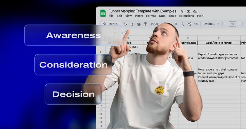
Dec 2, 2025 • 10 min read
Funnel Mapping Template: Match Your Content to Your Funnel
Oct 24, 2025 • 6 min read
Website ROI Calculator: Measuring Website ROI With CRO + SEOYour Next Deal Starts With Your Website
Most deals are won or lost before your sales team gets involved. Let's make sure your site is ready for that moment.
