Resource Center / Articles / 22 Inspiring Mega Menu Examples for Modern Websites (2026)
22 Inspiring Mega Menu Examples for Modern Websites (2026)
 Marko Lazarevic • Design & Inspiration • Published on Jul 23, 2025 • Updated on Jun 10, 2026 • 7 min read

TL;DR
Mega menu examples show how well-designed navigation can streamline large websites by organizing content into clear, multi-column layouts that improve usability and engagement.
When implemented effectively, they act as a gateway to your most important pages—like how Microsoft’s mega menu guides enterprise users to products, resources, and support with ease.
Here’s what great mega menu design delivers:
- Clarity and structure: Logical groupings and clear labels for seamless user journeys.
- Enhanced UX: Simplifies access to deep site content for B2B, SaaS, and e-commerce brands.
- Mobile adaptability: Responsive designs that work across all devices.
- Brand alignment: Navigation that reinforces your visual identity and guides conversions.
- Strategic visibility: Key links and CTAs surfaced right in the menu for maximum impact.
For brands with extensive offerings, a mega menu isn’t just a design choice—it’s the foundation for intuitive site navigation and stronger user engagement.
38% of visitors will leave a website if they find navigation confusing. That’s why mega menu examples are an essential resource for designers and marketers working on content-heavy platforms. A well-designed mega menu organizes links and categories into a clear, multi-column layout, helping users navigate complex websites with ease.
This article showcases 22 hand-picked mega menu examples from B2B, SaaS, e-commerce, and tech brands. Drawing from our experience as a B2B web design agency for SaaS and tech companies, we know how crucial intuitive navigation is for turning visitors into customers. Each example highlights how smart design choices combine structure, usability, and visual appeal to create seamless user experiences.
Of course, a well-designed navigation system is only one part of an effective B2B website strategy that helps attract and convert the right audience.
Equally important is having a high-converting pricing page — you can draw inspiration from some of the best pricing page examples to ensure yours is optimized for conversions. And to see how all these elements come together, check out our list of the best B2B websites for broader web design inspiration beyond navigation.
Whether you’re building a SaaS platform with dozens of features or an e-commerce store with hundreds of products, these mega menu designs will give you the inspiration you need to improve your site’s navigation.
What is a Mega Menu (and Why Use One)?
A mega menu is an expanded navigation interface that displays multiple columns of links, categories, and sometimes rich content in a single dropdown panel. Unlike traditional dropdown menus, mega menus provide users with a comprehensive overview of a site’s structure at a glance. As Nielsen Norman Group explains, they also reduce the number of clicks needed to reach deeper pages, improving usability on large websites.
Key Features of Mega Menus
- Multi-column layouts to organize links logically.
- Headings and subheadings for better hierarchy.
- Visual elements like icons or images to improve scannability.
- Quick access to deep site content without multiple clicks.
Benefits of Mega Menus
- Simplify navigation on content-heavy sites.
- Reduce bounce rates by helping users find pages faster.
- Surface key sections or products for better discoverability.
- Improve user experience on large-scale SaaS, e-commerce, or enterprise sites.
Mega menus are especially valuable for websites that cater to diverse audiences or offer numerous products and services. They flatten navigation hierarchies, allowing visitors to find relevant pages without excessive drilling down.
B2B & SaaS Mega Menu Examples
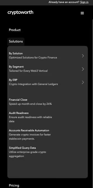
Cryptoworth Mega Menu: Streamlined Navigation for Web3 Finance Solutions
Cryptoworth sells to three audiences with three different mental models — finance teams, Web3 CFOs, and external accountants. The Solutions dropdown reflects that with a faceted layout: three lenses on the left (By Solution, By Segment, By ERP), and the right pane updates as the cursor hovers.
Why it works: each persona enters through the path that matches how they think — no one scans everyone else's list.

Cryptoworth on Mobile: Collapse the Facets, Anchor the CTA
On mobile, the desktop's two-pane faceted dropdown collapses into a single scrollable column. The three lenses (By Solution, By Segment, By ERP) appear as full-width cards followed by their sub-items. The "Book a Demo" CTA stays anchored at the bottom of the screen.
Why it works: the faceted logic survives the format change without forcing users into nested accordions, and the conversion action is always one tap away.
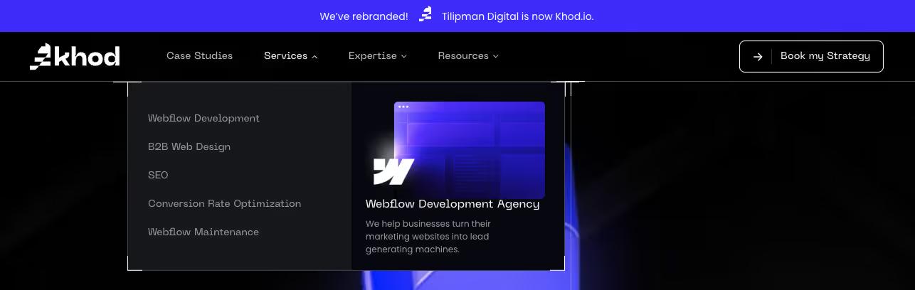
Khod Mega Menu: Three Dropdowns, Sorted Three Ways
Khod's three dropdowns each use a different organizing logic: Services by service type, Expertise by industry and stage, Resources by resource type. Every dropdown ends with a visual card pointing to a high-intent page like Webflow Development Agency or the Funnel Mapping Template.
Why it works: each dropdown matches how a visitor arrives — shopping for a service, matching a buyer profile, or hunting for resources — and the featured card turns the browse into a next step.
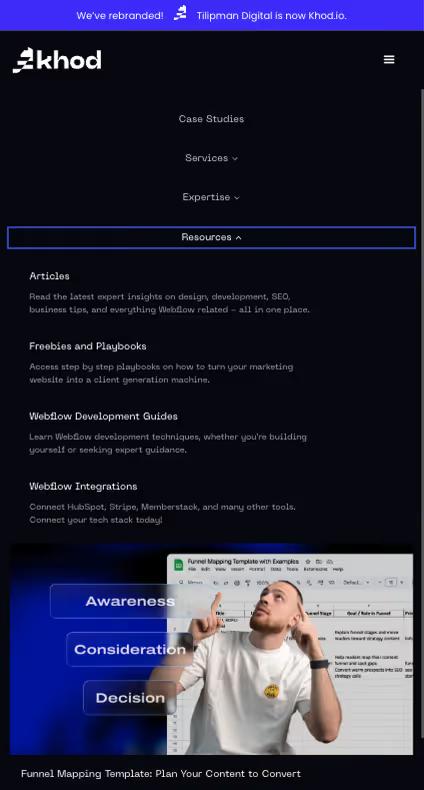
Khod on Mobile: Accordion with the Featured Cards Preserved
On mobile, each dropdown collapses into an expandable section that opens one at a time. The featured visual cards stay in place — they're not stripped out — and value props sit alongside each link instead of being hidden behind another tap. The "Book my Strategy" CTA stays anchored at the bottom.
Why it works: the conversion path and the value-prop context survive the small screen, and the accordion behavior keeps the page from becoming a wall of links.
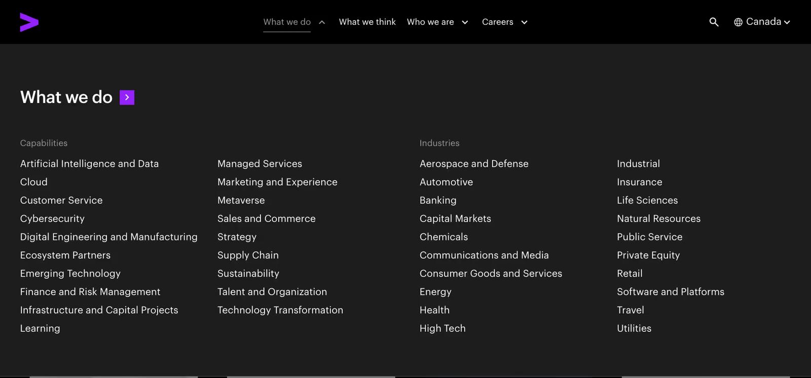
Accenture Mega Menu: Services, Industries, and Thought Leadership
Accenture's "What we do" dropdown shows two parallel taxonomies side by side — 19 Capabilities and 20 Industries — at the same time. No descriptions, no icons, no featured cards. Just text links across four columns, two per taxonomy.
Why it works: at Accenture's scale, every buyer enters with one of two mental models — "I need cybersecurity help" or "I'm in banking and need a partner." Showing both paths simultaneously eliminates the wrong-tab problem.
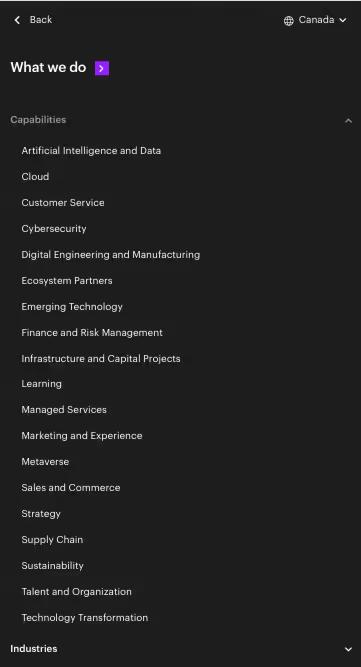
Accenture on Mobile: Pure Accordion, Zero Merchandising
On mobile, Accenture collapses to a pure accordion. Capabilities and Industries become two top-level expandables, with everything stacked as plain text — no images, no descriptions, no featured cards. One section opens at a time.
Why it works: enterprise buyers already know what they're looking for. Stripping out the merchandising layer respects their time, and the accordion keeps a list of 39 items from becoming a single overwhelming scroll.
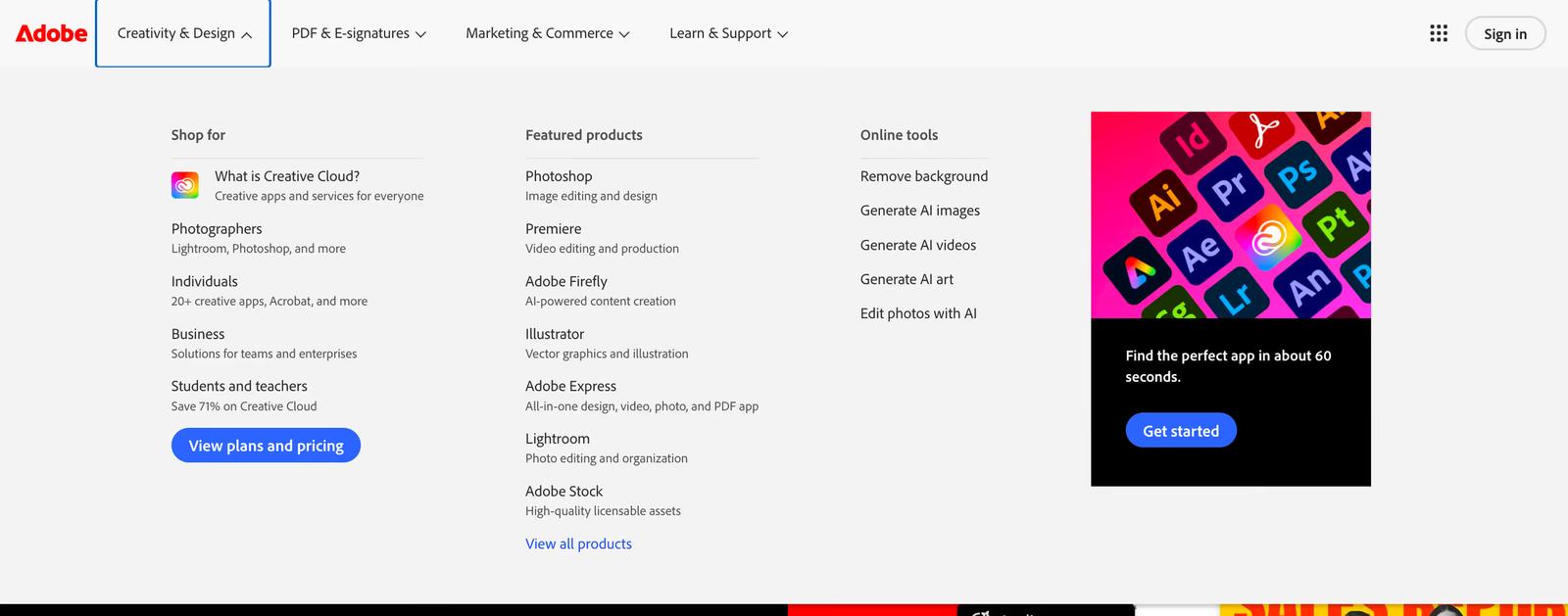
Adobe Mega Menu: Creative Tools and Business Solutions
Adobe sells the same products to very different audiences, from photographers, to businesses and even students. Each dropdown opens with three parallel columns: Shop for (by audience), Featured products (by name), and Online tools (by task). A "View plans and pricing" CTA sits at the bottom.
Why it works: buyers enter through whichever lens they use, and the Online tools column captures one-off task intent ("Compress PDF", "Remove background") that would otherwise leave for a competitor.
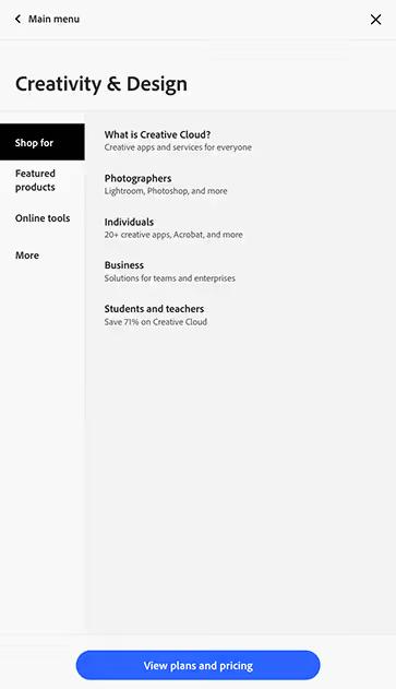
Adobe on Mobile: Master-Detail with a Separate Apps Switcher
Tapping a top-level item opens a sub-page with vertical tabs on the left (Shop for, Featured products, Online tools) and content on the right. A "View plans and pricing" CTA stays anchored at the bottom. A separate 9-dot apps switcher opens a grid of web apps for returning users.
Why it works: the master-detail pattern keeps a huge catalog browsable without endless scrolling, and the separate apps switcher respects that returning users just want to launch their tool.
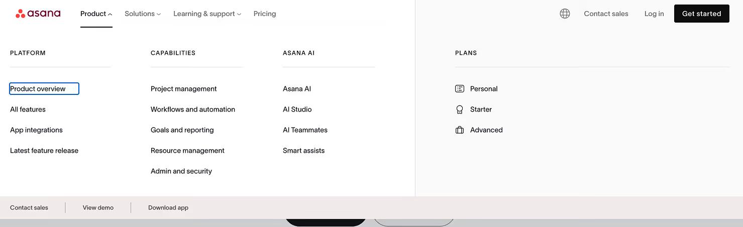
Asana Mega Menu: Organized Product Features and Solutions
Asana's Solutions dropdown slices the same product four ways, by company type, team, industry, and use case, all at once. The Product dropdown surfaces Plans with icons next to features. A persistent utility bar at the bottom of every dropdown offers three conversion paths: Contact sales, View demo, Download app.
Why it works: Asana sells to wildly different buyers, so the menu shows all four lenses instead of forcing a choice. Conversion is always one click away.
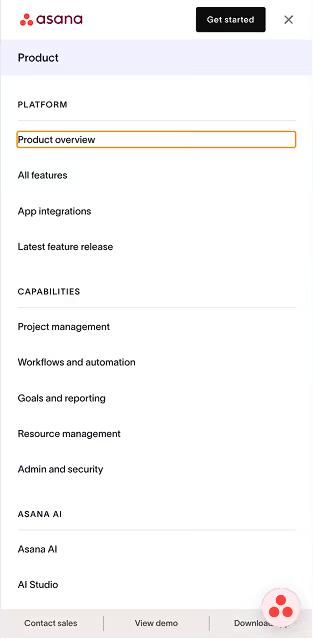
Asana on Mobile: Pure Linear Scroll, Sticky Conversion Bar
On mobile, Asana uses pure linear scroll — no accordions, no tabs. Every section header (Platform, Capabilities, Asana AI) sits in ALL CAPS above its list, and the lists flow continuously down the screen. The utility bar (Contact sales, View demo, Download app) stays anchored at the bottom.
Why it works: scrolling is faster than tapping. Showing every section open at once respects users who already know what they want and don't enjoy hunting through accordions.
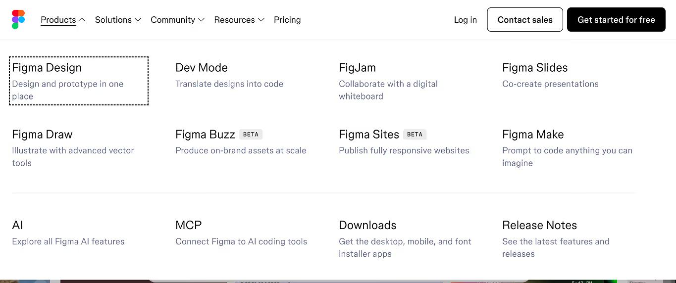
Figma Mega Menu: Clean Typography and Creative Resources
Figma's Products dropdown uses a 4×2 grid instead of a list — each product is an equally-weighted tile with BETA badges inline where relevant. A divider separates the products from cross-cutting items: AI, MCP, Downloads, Release Notes. The Solutions dropdown slices the same product on three axes: Use Cases, Roles, Organizations.
Why it works: the grid treats Figma's expanding product line as peers, not a hierarchy. BETA labels in the nav set expectations honestly before someone clicks.
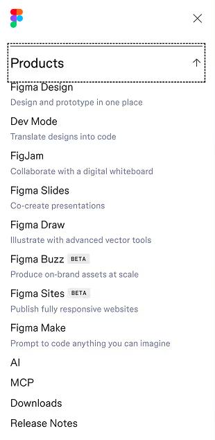
Figma on Mobile: Drill-Down Navigation, Not Accordion
Figma's mobile pattern is drill-down navigation, not an accordion. Tapping a top-level item slides into a dedicated sub-page that fills the screen — each item gets its full layout, like a native iOS view. An up-arrow returns to the main menu.
Why it works: for a design tool whose buyers are designers, the iOS-style drill-down feels native. Showing one full section at a time avoids the visual noise of accordions and respects the small screen.
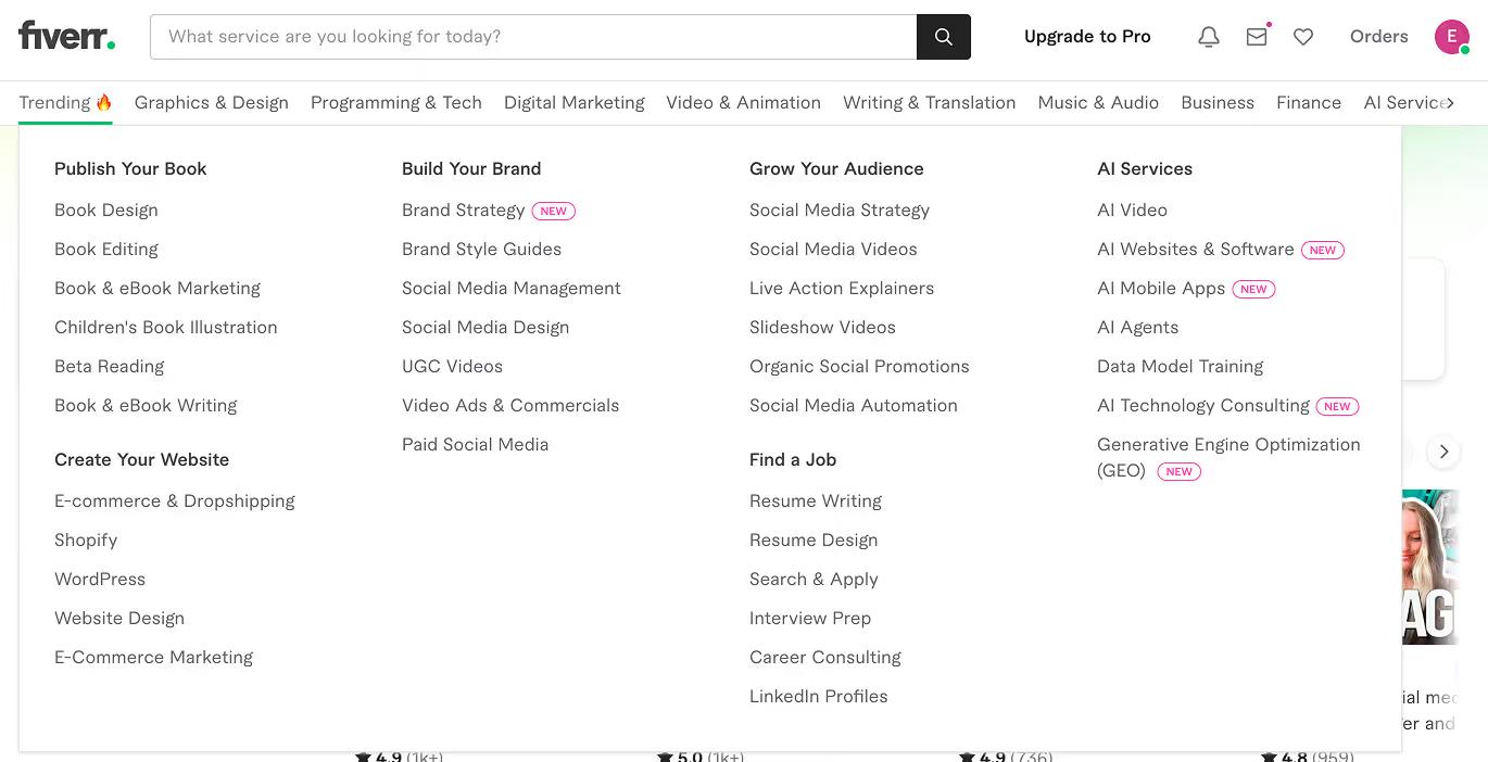
Fiverr Mega Menu: Two Taxonomies for Two Buyer Modes
Fiverr runs two taxonomies in parallel. The top nav lists services by type (Graphics & Design, Programming & Tech). The "Trending 🔥" mega menu instead organizes by outcome — Publish Your Book, Create Your Website, Build Your Brand, Grow Your Audience — with NEW badges flagging recent additions like AI Agents and Generative Engine Optimization.
Why it works: marketplace buyers come in two modes — "I need a logo designer" and "I want to launch my store." Fiverr serves both without forcing a choice.
Fiverr on Mobile: Three-Level Drill-Down for a Massive Catalog
On mobile, Fiverr uses three-level drill-down navigation. The hamburger opens to account actions and "Browse categories." Tapping that reveals the category strip; tapping a category opens the outcome-grouped sub-list inside. Each level has a back arrow.
Why it works: drilling down respects the small screen by showing one focus at a time. A marketplace with this many categories can't fit on one screen, and accordions would create a wall of nested lists.
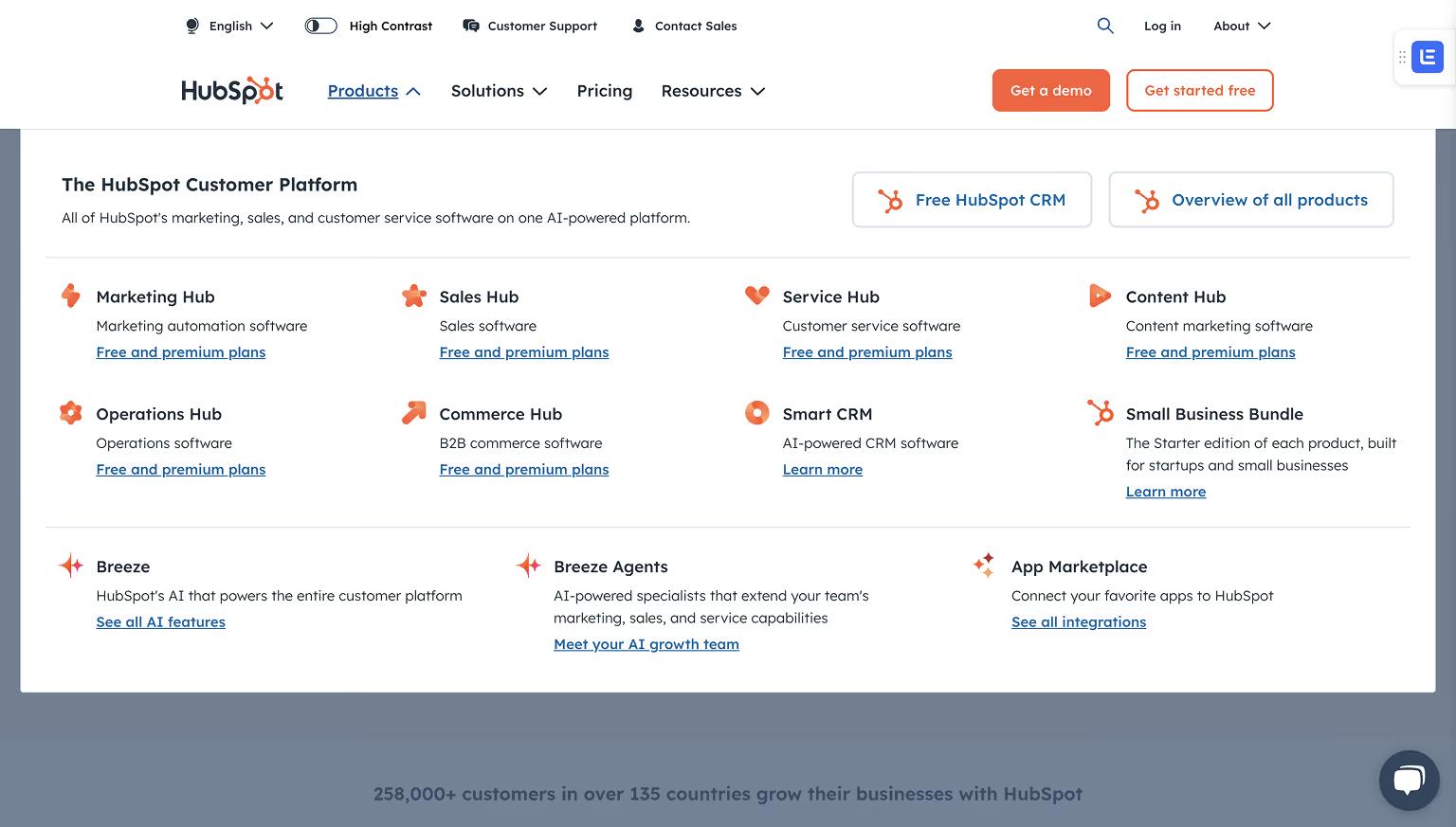
HubSpot Mega Menu: Marketing, Sales, Service, and CMS Hubs
HubSpot’s mega menu highlights its hubs (Marketing, Sales, Service, CMS) with clear groupings. It also features resource links for blogs, templates, and academy content, making it easy for users to explore tools and educational material.
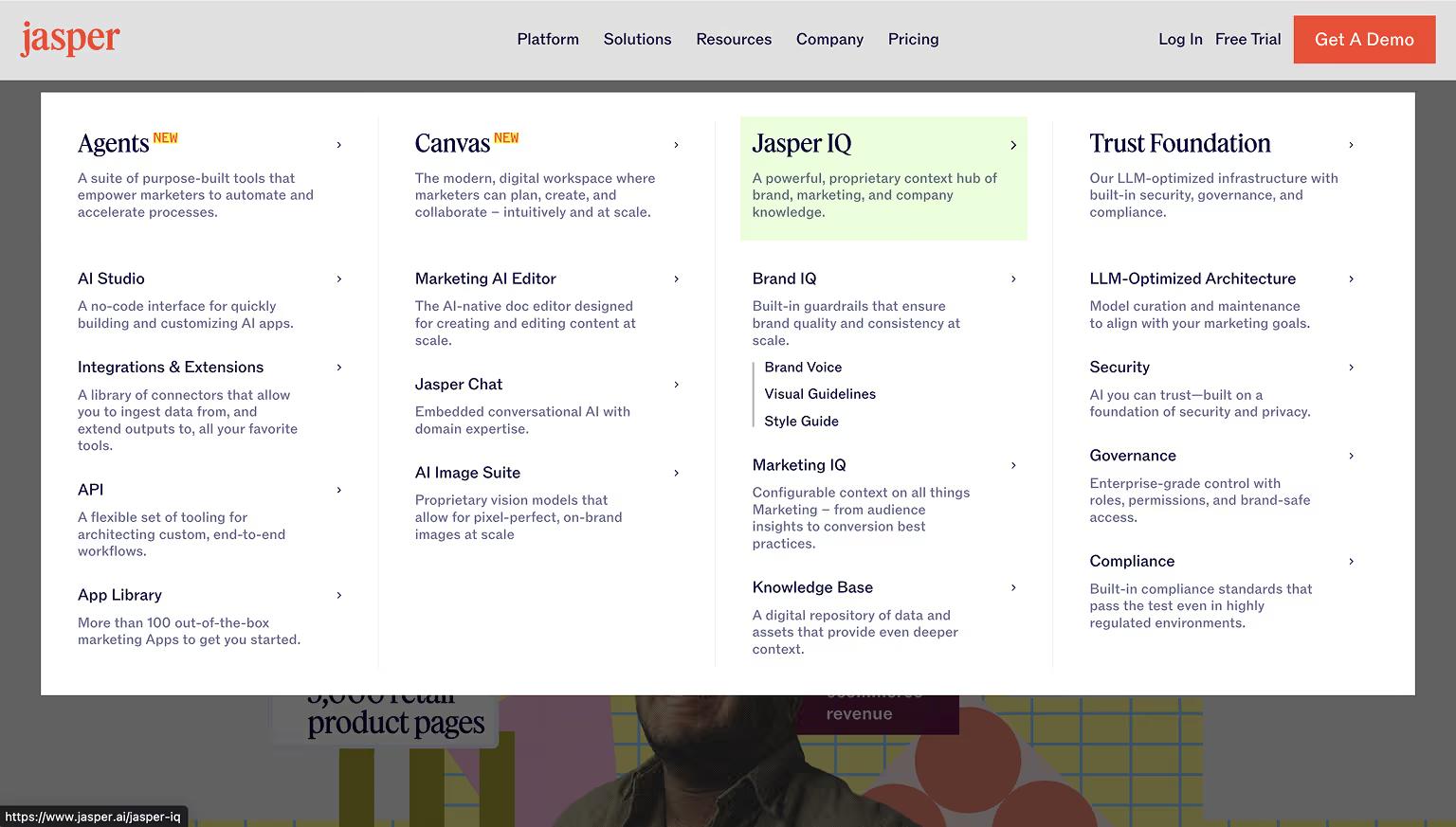
Jasper Mega Menu: AI Tools and Templates Organized by Use Case
Jasper’s menu caters to both new and returning users by listing AI tools and templates by use case. Visual cues like icons help users scan options quickly, while featured links to webinars and resources promote product education.
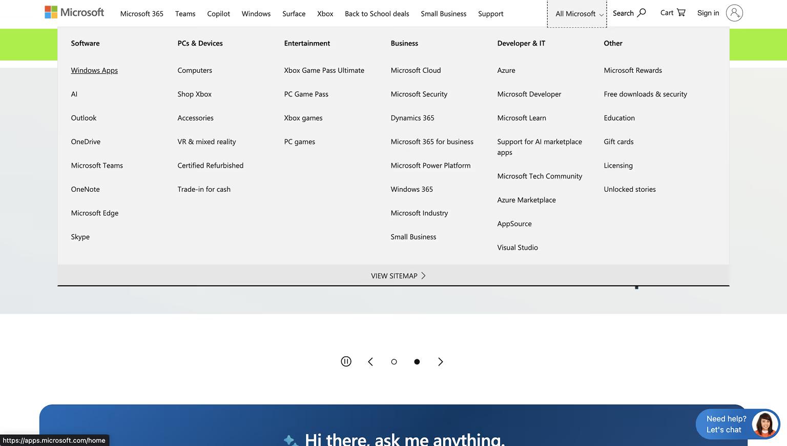
Microsoft Mega Menu: Enterprise Products and Subcategories
Microsoft’s mega menu categorizes links by product families such as Office, Azure, and Surface. It uses icons and subcategories for a clean, user-friendly navigation experience tailored to business and consumer audiences.
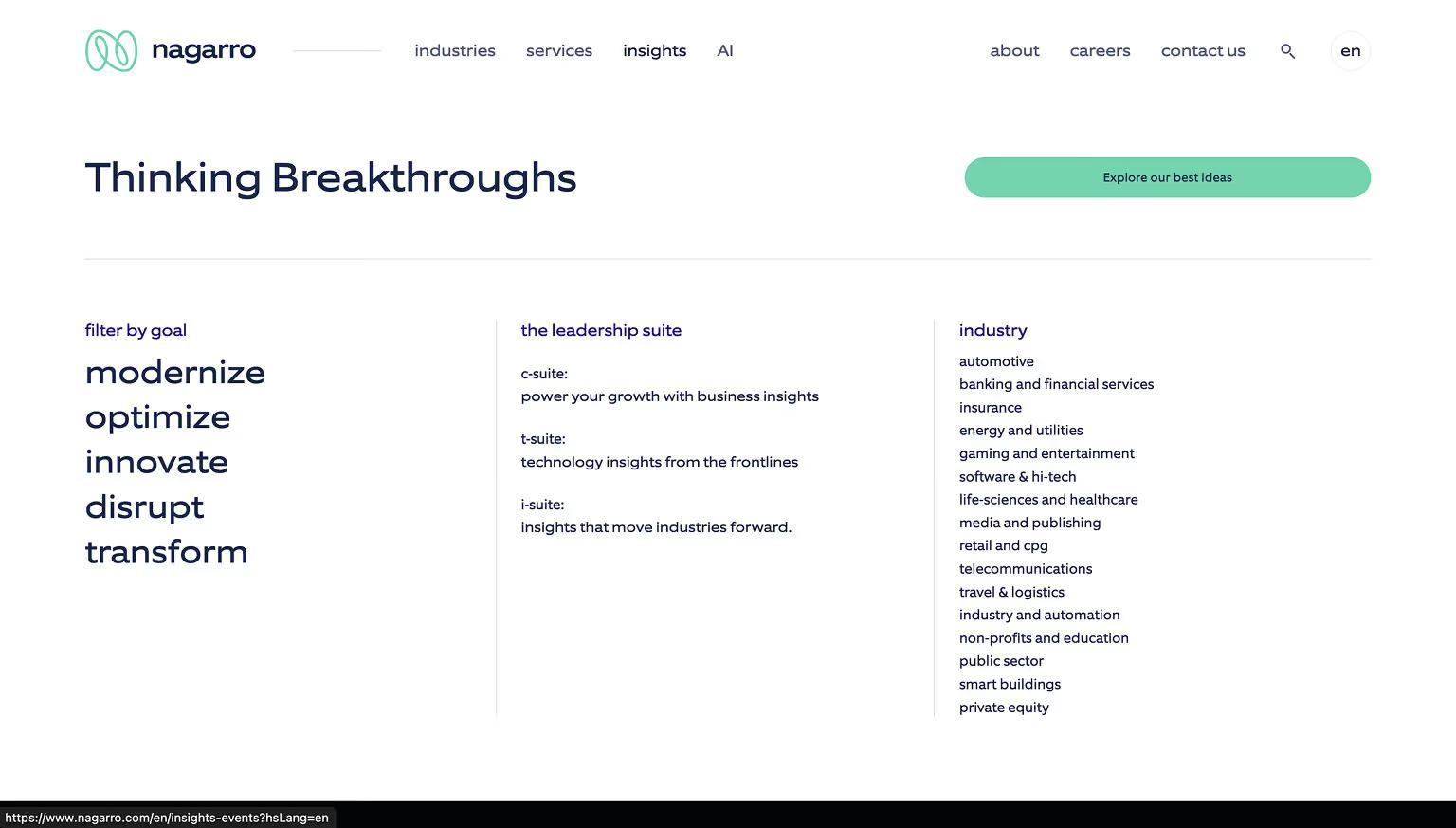
Nagarro Mega Menu: Enterprise Services and Industries at a Glance
Nagarro’s mega menu reflects its role as a global digital engineering leader. The menu organizes solutions and industries into intuitive groups, with featured sections like “Industries,” “Services,” and “About Us.” The clean design and use of whitespace make it easy for enterprise users to find relevant content quickly.
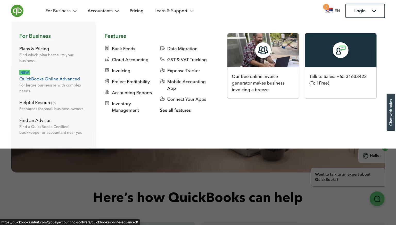
QuickBooks Mega Menu: Plans, Features, and Support Links
QuickBooks organizes its mega menu into clear categories like Plans, Features, and Resources. It provides quick links for both small businesses and accountants, streamlining access to tools and support pages.
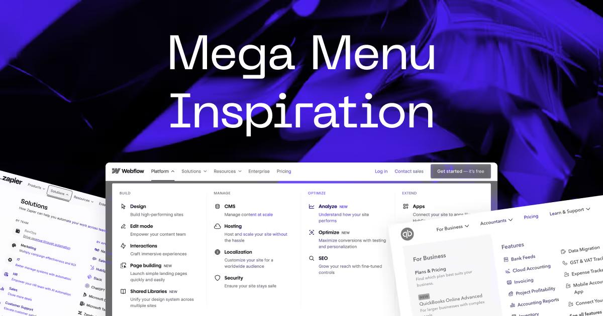
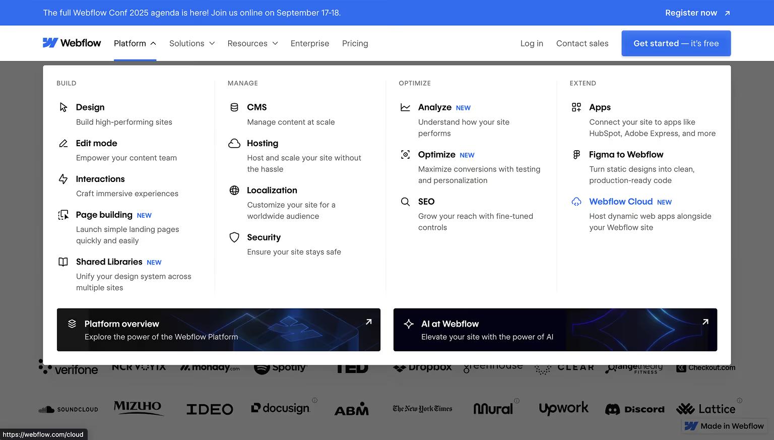
Webflow Mega Menu: Balanced Layout for Products and Community
Webflow’s mega menu balances a large volume of content with a structured layout. It includes columns for Products, Solutions, Resources, and Community. Icons enhance usability, while links to educational content and community forums support different user segments.
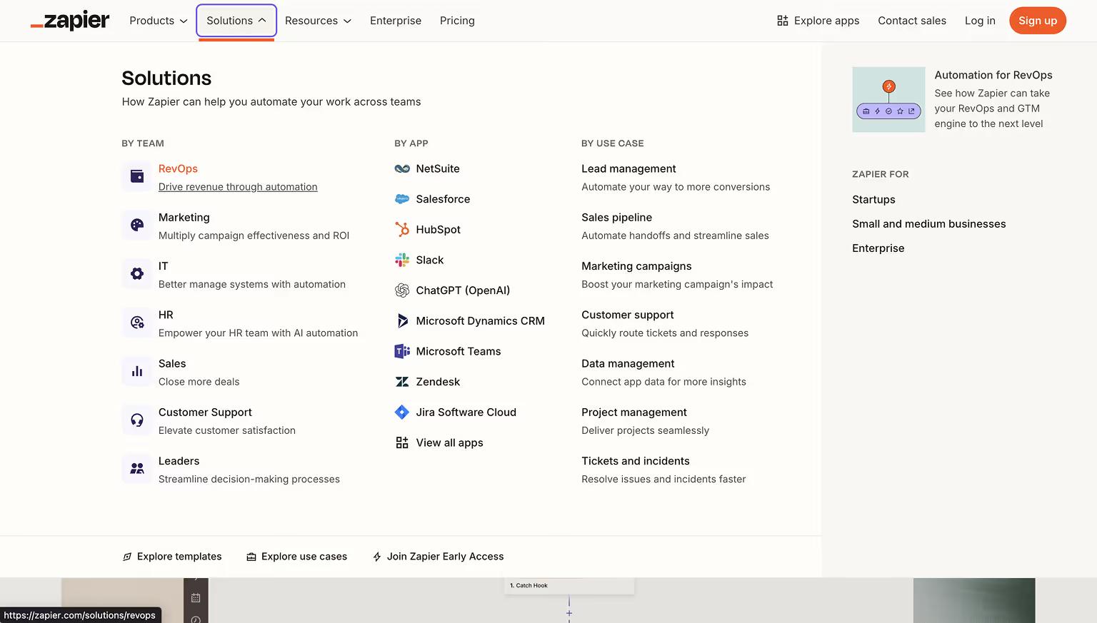
Zapier Mega Menu: Simplified App Integration Navigation
Zapier’s mega menu simplifies navigation for a platform with hundreds of app integrations. It divides content into two approaches: by app name and by use case, making it easier for users to explore workflows or locate specific integrations. New features are highlighted with badges for visibility.
These examples illustrate how B2B and SaaS brands use mega menus to guide diverse audiences efficiently, promote key actions, and reflect their brand identity.
E-Commerce & Retail Mega Menu Examples
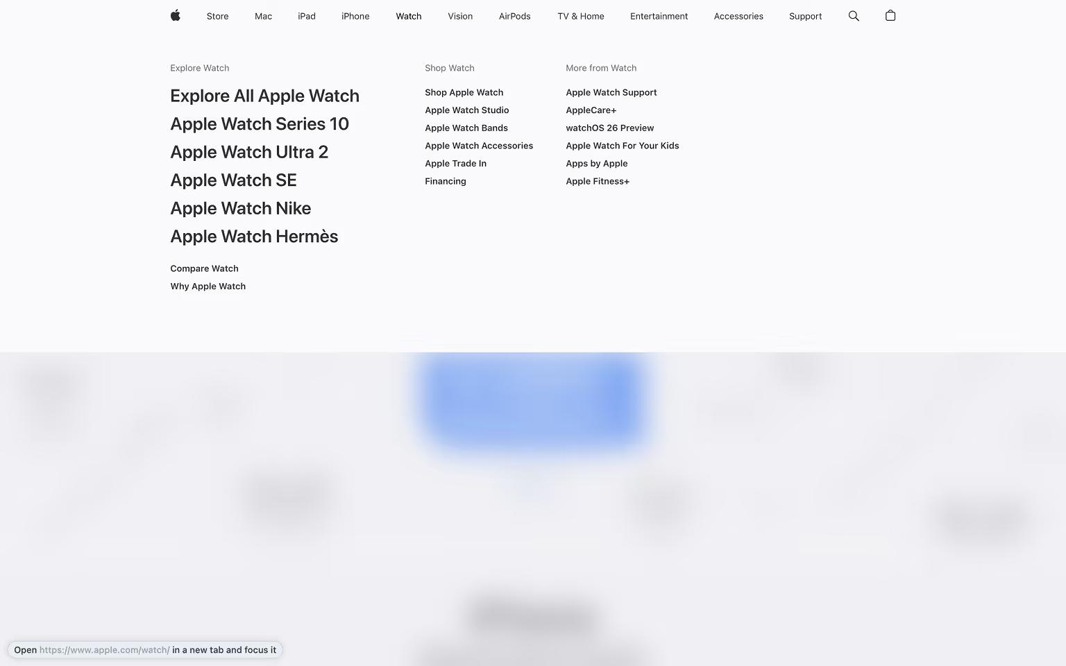
Apple Mega Menu: Minimalist Layout Showcasing Product Families
Apple’s mega menu provides a clean and simple layout. It showcases product families like Mac, iPhone, and iPad with icons and minimal descriptions, reflecting Apple’s design philosophy.
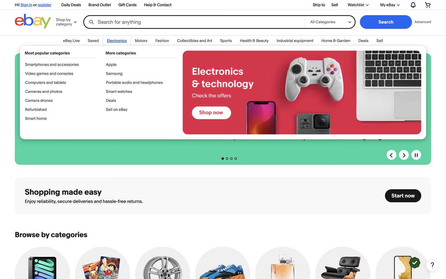
eBay Mega Menu: Category Icons and Seasonal Sales Highlights
eBay’s mega menu lists categories with supporting icons and highlights seasonal sales or trending products. Users can easily browse departments like Electronics, Fashion, and Home & Garden.
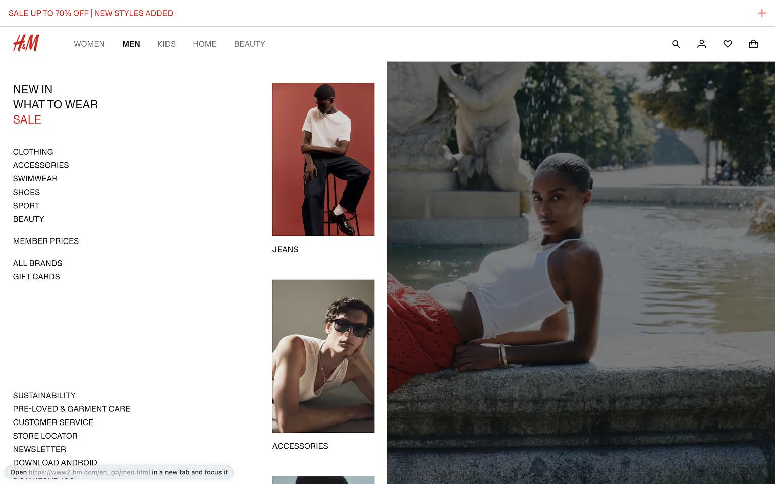
H&M Mega Menu: Fashion Categories and Trend Campaigns
H&M’s mega menu combines product categories with imagery for trending collections and campaigns. Strategic placement of sale and loyalty program links adds marketing value to the navigation.
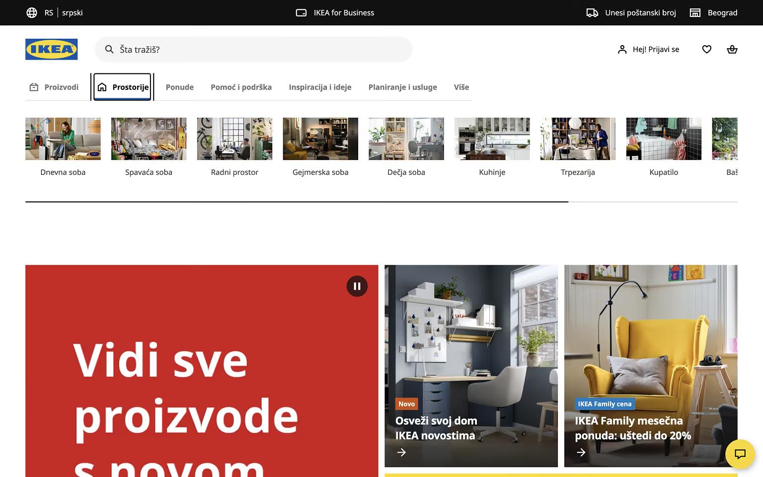
IKEA Mega Menu: Room-Based Navigation with Clear Icons
IKEA uses a mega menu to help users browse by room (Living Room, Kitchen, Bedroom) or product type. Simple icons and clear headings improve usability, while featured links highlight promotions or new arrivals.
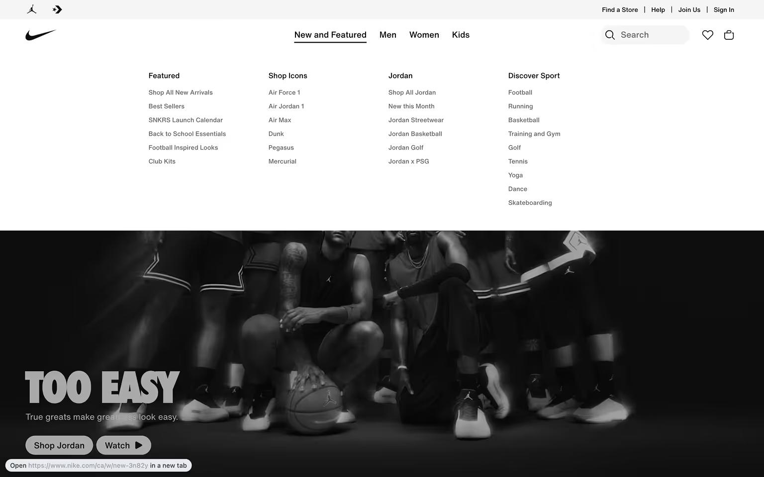
Nike Mega Menu: Clothing and Footwear Categories by Audience
Nike’s mega menu showcases Men’s, Women’s, and Kids’ categories with sub-sections for Shoes, Clothing, and Accessories. Featured collections and new releases are paired with product images, creating a visually engaging navigation experience.
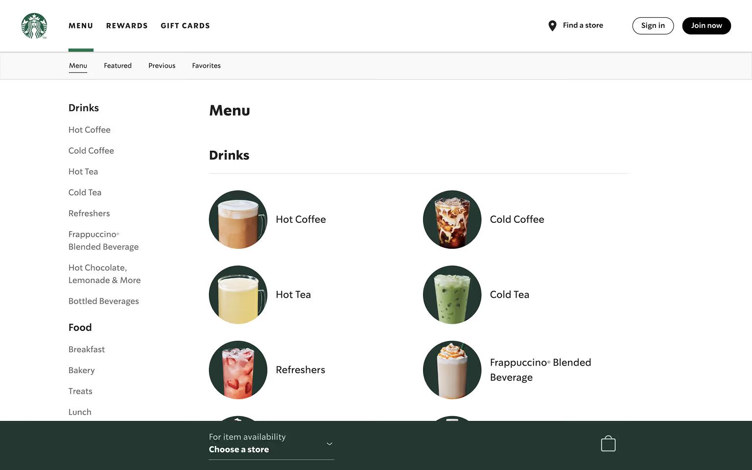
Starbucks Mega Menu: Food and Drink Categories with Visuals
Starbucks uses a mega menu for sections like Menu and Coffee. Each category includes images or icons to showcase drinks, food items, and seasonal offerings.
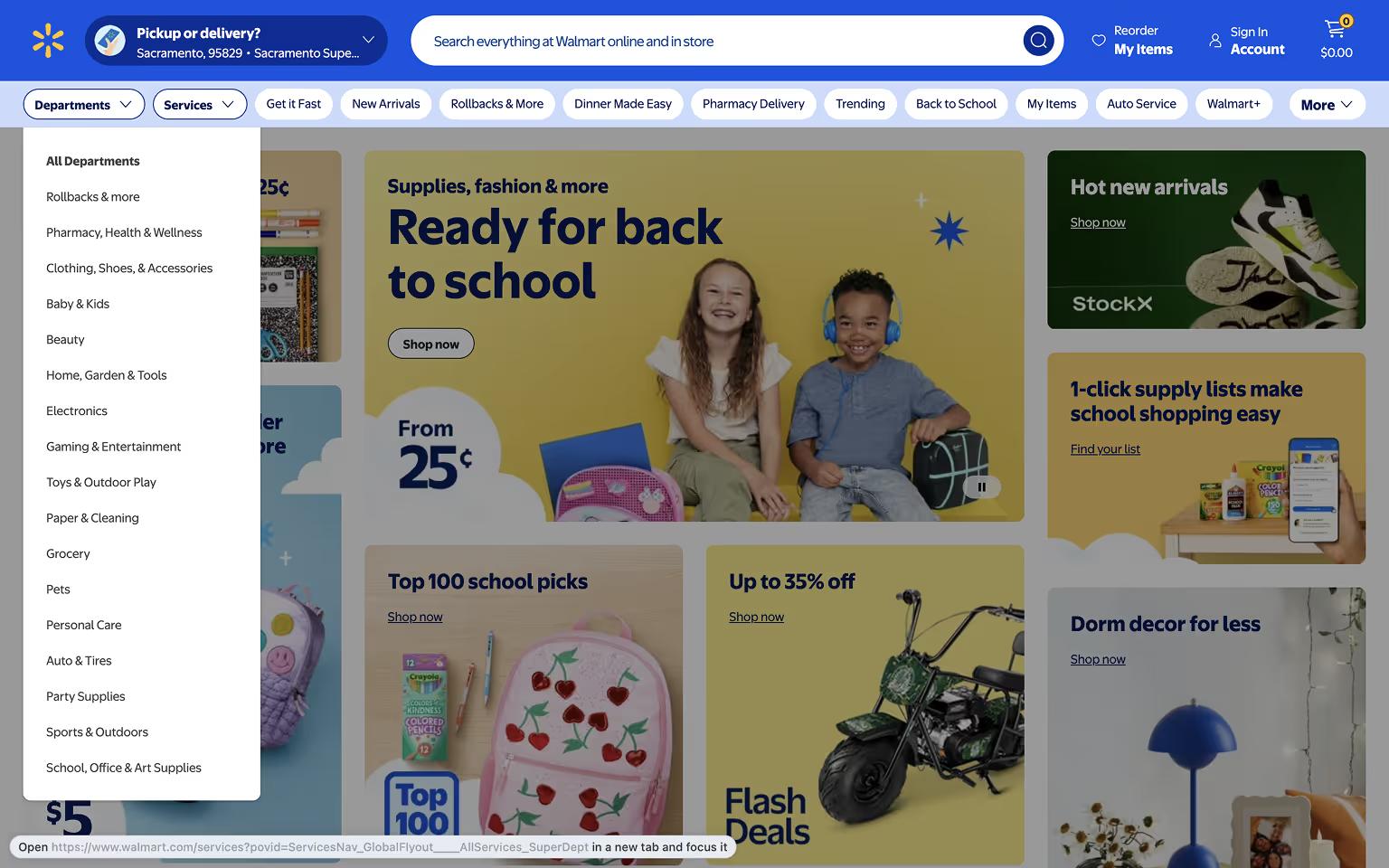
Walmart Mega Menu: Departments and Promotions for Quick Access
Walmart’s mega menu simplifies browsing with clearly labeled departments like Grocery, Electronics, and Clothing. It highlights seasonal promotions, top deals, and services like pharmacy pickup, making it easy for users to access high-demand areas.
These examples show how e-commerce brands use mega menus not just for navigation, but also for merchandising and driving user engagement.
Tech & Digital Platform Mega Menu Examples
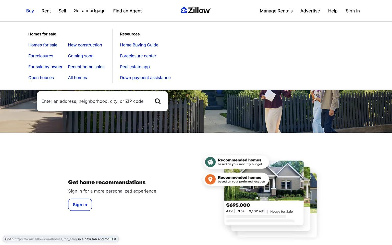
Zillow Mega Menu: Real Estate Categories for Buyers and Renters
Zillow’s mega menu organizes services for buyers, sellers, and renters. Categories include Buy, Rent, Sell, and Home Loans, often supported by tools like mortgage calculators and search filters.
Mega Menu Design Best Practices
Organize Content Logically
Structure links into clear columns with headings and subheadings. Group related items together to help users scan and navigate easily.
Use Visual Elements Sparingly
Icons or images can enhance usability but should not overwhelm the menu. Prioritize clarity and keep visual elements subtle.
Keep Menus Clean and Focused
Avoid clutter by limiting the number of links. Highlight only the most important categories and pages to reduce decision fatigue.
Prioritize Mobile Responsiveness
Adapt mega menus for smaller screens using collapsible sections or simplified mobile menus. Ensure touch targets are large enough for easy navigation.
If you’re building in Webflow, working with an experienced Webflow development agency can help you implement responsive mega menus that scale with your site’s needs.
Include Strategic Calls-to-Action
Embed key actions like “Contact Sales,” “Shop Now,” or “Get a Demo” within the menu to guide users toward conversions.
Test and Optimize
Monitor user behavior and refine your mega menu over time. A/B test designs to improve usability and engagement.
These practices ensure that mega menus improve navigation, enhance user experience, and align with overall site goals.
Want to take your SaaS site’s navigation to the next level? Our Ultimate SaaS Website Navigation Playbook gives you the strategy and tools to design user flows that convert.
Frequently Asked Questions (FAQs) about Mega Menus
Are mega menus good for SEO?
Yes, when built correctly. Google crawls mega menus rendered in HTML, even if the dropdown is hidden by default. There are two concerns:
- Stuffing the menu with too many links dilutes the authority each one passes, and
- JavaScript-only menus that only load on interaction can fail to index.
Keep markup semantic, limit the link count, and a mega menu helps SEO more than it hurts.
When should I NOT use a mega menu?
Skip it if your site has fewer than 30 pages, a standard nav handles that volume better. Skip it if your audience already knows what they want; a search bar beats menu-scanning. And skip it if no one owns maintaining it; mega menus go stale quickly when products, pricing, or industries shift, and a stale menu signals a stale company.
How do I build a mega menu on mobile?
On mobile, the best practice is to re-architect the menu for vertical scroll. We identified a pattern that works: using a full-screen drawer or accordion where one section expands at a time, links stack as single-column lists with their value props visible (not hidden behind a tap), and the primary CTA stays anchored at the bottom of the screen. Keep depth to one tap wherever possible; mobile users hate hunting through nested layers.
How do I make a mega menu accessible?
Three things matter most:
- Every link reachable with
Tabkey, every dropdown openable withEnterorSpace, andEscapecloses it. - ARIA roles and
aria-expandedstates so screen readers announce when a menu opens or closes. - A visible focus indicator that meets WCAG AA contrast.
Mega menus often fail accessibility audits because they're built mouse-first; design for the keyboard and the mouse will follow.
Marko Lazarević is the Design Lead at Khod and one of the co-founders of Divhunt — a no-code builder for people who want pixel-perfect control without digging through 300 lines of code.
With a sharp eye for clean interfaces and a low tolerance for clutter, Marko’s designed everything from SaaS dashboards to landing pages that do more than look good — they actually convert. At Khod, he turns vague client ideas into web experiences that make sense (and make money).
He’s the guy you bring in when you’re tired of talking about design systems and just want something to launch.
Table of Content


Kickstart your project today!
Book a call to discuss your goals and how we can help you reach them.
Share the Article
Explore Related Articles

News & Events • May 22, 2026 • 6 min read
flowConf 2026: Notes from a Packed Day in Belgrade
Website Strategy • May 1, 2026 • 7 min read
GROW Framework: Put Strategy First. Always.
News & Events • Mar 30, 2026 • 5 min read
Tilipman Digital Is Now Khod: Why We RebrandedYour Next Deal Starts With Your Website
Most deals are won or lost before your sales team gets involved. Let's make sure your site is ready for that moment.
